Wednesday, October 30, 2013

Social Icons Tutorial

I had a link in my credits section to another blogger who had a great tutorial on how to make social icons on your site.  (like the ones on my sidebar)  Unfortunately they have since taken the post down. So, I have decided I will just make a tutorial here.  Since my knowledge of coding is fairly limited I'm confident I can keep it simple enough for anyone to understand.  :)  

Images can be clicked to be enlarged.

Part One-

(you can skip to part two if you have already found or made social icons and just need to know how to do the codes!)

Find social icons!  You can find free social icons on many sites.  I got the ones I used in my sidebar from here.

(Note- Please be sure to credit the people you use social icons from.  It takes a lot of work to make things like this and it's pretty awesome people are willing to offer them for free.)  

If you have the fortitude to make your own social media icons I will give you some quick tips on how to best do that.  I will be using CS5 for the purpose of this demonstration but it should work in a similar fashion with any version of photoshop and probably other similar programs such as Gimp or Paint.net.

1. Locate social network icon pngs.  I found some here.

2. Once you've located them save and extract (in this case they're in a zipped file).  

3. Open with your photo editing program of choice. 


4. Make a new file and go to layer > new > layer 


Then you will have this.


5. Staying on the new layer use the custom shapes tool to make a shape.


6.  Next you want to drag the vector image of the social icon on top of the other image.


7.  This particular set of vectors comes in black only.  If you want to change it to white you can do the following.  While the layer the "f" is on is selected click image > adjustments > brightness/contrast.  


Slide both sliders to "100" and viola, you've got a white "f".


8. Unless you want to do anything else fancy to it like textures, gradients, or embossing you're finished and may proceed to the the next step!  If not here's how you can do those things.

To make gradients, textures, or embossing you need to right click the layer you want to change and click blending options.  Here you can change most anything you like.  Here are some examples.


Using bevel and emboss on both layers separately.


Using a gradient overlay on the heart shape layer only.


Using a pattern overlay on the heart layer only.  Texture from Lost and Taken.


Using stroke on each layer separately.  

The possibilities are pretty endless these are just some suggestions of variations you can try with your own stuff.  :)

Now on to the next step!

9. You want to merge the first two layers together and delete the background.  Right click the top layer and click merge down.  

Once you've done that right click the background and click delete layer.


10.  Save the image as a .png.  This part is important because if you do not save it as a .png it will not have a transparent background and will have a white background when you upload it to another site for use.  


Part Two-

1.  You need to upload your images someplace so you can have a url to use.  Some people use image hosting sites like imageshack.  Personally I just used my tumblr and set the post to private so no one but me could see it. 

2.  Now to the code!

<a href="url of where you want the social icon to lead to goes here"target="_blank" ><img src="url of your image you're using for your social icon goes here" height="48" width="48" /></a>

Height and width determine how many pixels tall and wide your image shows up as.  You will probably want to play with it a bit to find a size that works best for your site.  

To get the url of the image you want to use for the icon you need to go to the site where you uploaded your images and right click the particular image you want to use.  After you right click scroll down and click copy image url.

3. How to use this on blogger- 

Go to the layout tab.  Once you're there you will see this. 


Click add a gadget. 


You will want to use the html/java script gadget.


Now all you have to do is copy and paste the code and add in your site and image urls and pick a title.  Then be sure to click save and click save arrangement in the upper right corner of the layout tab and you're done!  :D  

I have also successfully used this code on tumblr for my "I sell on" badges.  Which can be seen here.  All I did was use the same exact code and put it in the description box.  :)

I have not used this code on any other sites but I assume it will work on any site that allows you to add your own html codes.  

I hope this is helpful and easy to understand.  If it is not please feel free to ask any questions.  


Thursday, October 17, 2013

The Lies Perfectionism Tells You

I picked up a copy of psychology today a couple weeks ago because it had an article that piqued my interest.  The cover article was titled, When Virtue Becomes Vice (you can read the whole article online).  Initially I thought, okay this is going to be something dumb about how being nice is overrated etc.  I was pleasantly surprised to see that's not what it was about at all.  

One particular part of the article really struck a chord with me.  The flipside of being a perfectionist is nothing will ever be good enough.  You will never be happy with your work.  You will also likely become a huge procrastinator.  

The danger in perfectionism is that it's something we see as a virtue.  "Oh, they're a perfectionist so they will strive harder to better themselves."  When we hear the word perfectionist we typically think things like, hard worker, good work, excellence.  

The truth of the matter is being a perfectionist is essentially shooting yourself in the foot.  This is something I've had to learn the hard way.  I always felt like being a perfectionist when it came to myself and my work was a good thing.  It meant I wanted perfection.  The problem lies in the truth that no one is perfect.  I find myself putting things off and being overwhelmed by them more often than not because I get hung up on being "perfect".  If I can't do it perfectly then I don't want to do it.  If the process doesn't go smoothly then it really upsets me.  

An excellent point brought up in the article is how in the end it does not matter if the process is perfect.  What matters most is the result of the process.
Perfectionism is a trap.  You wind yourself up when the process or result isn't perfect even if it's still wonderful.  

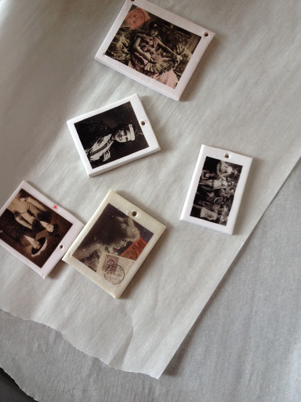
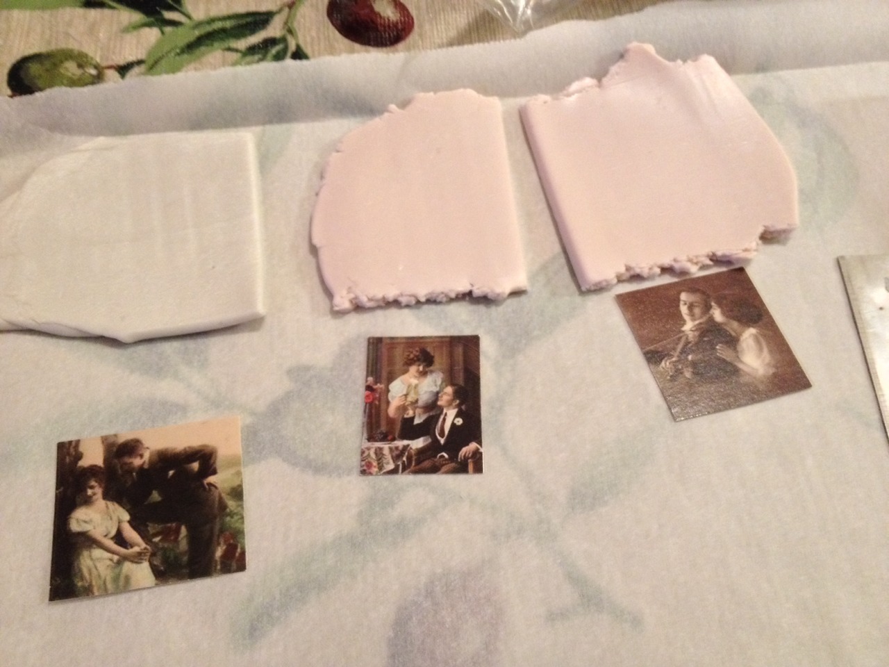
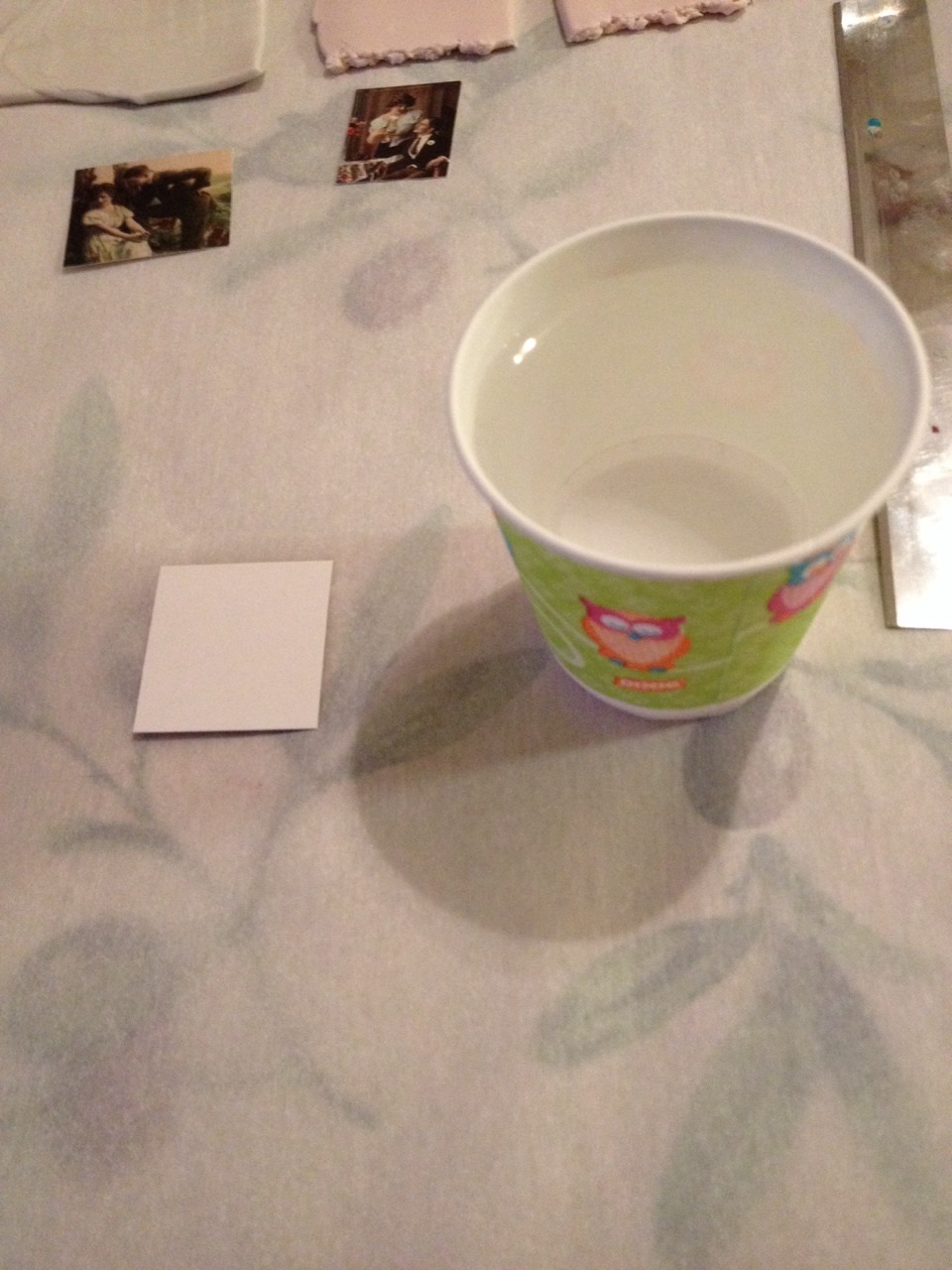
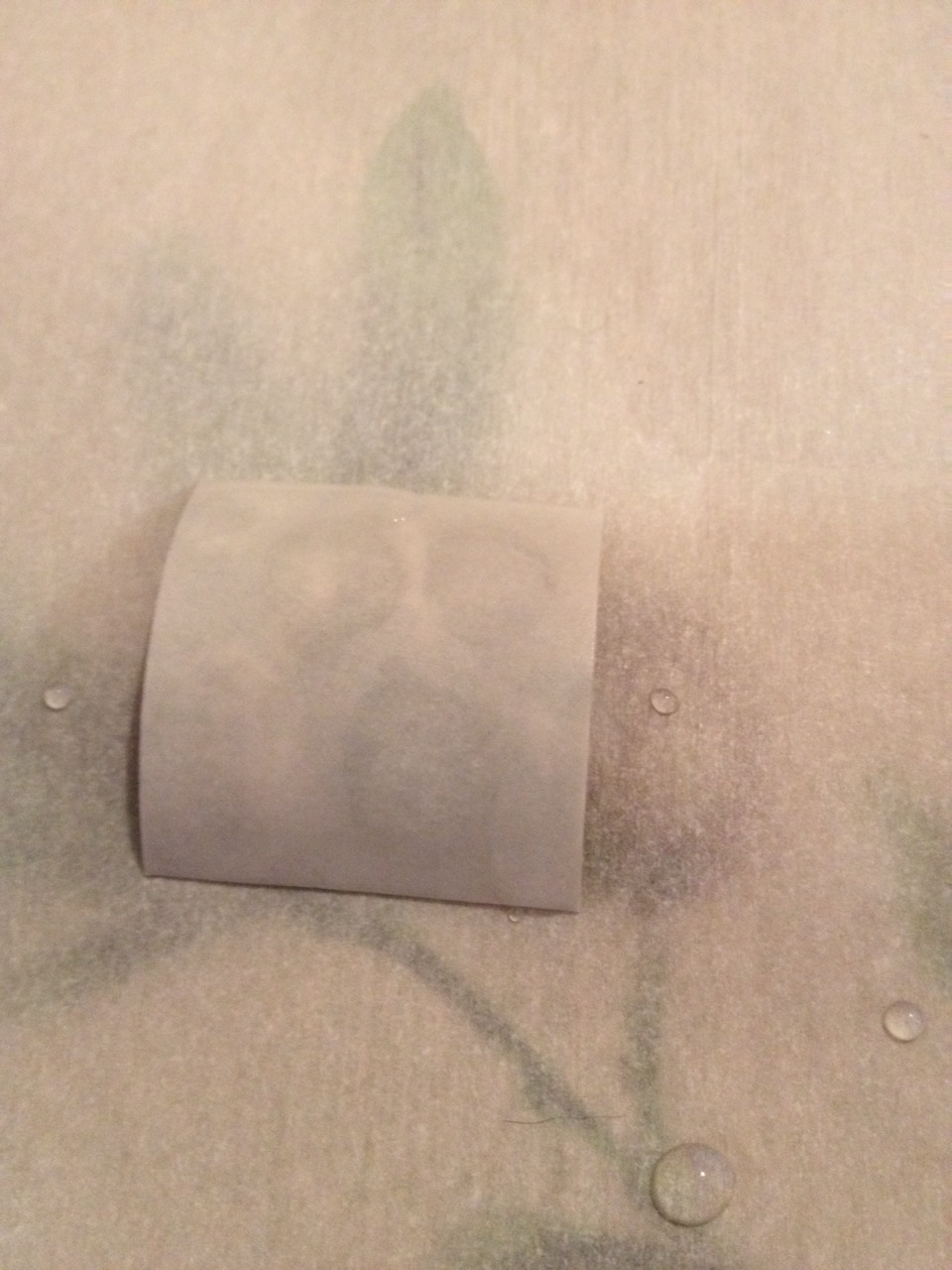
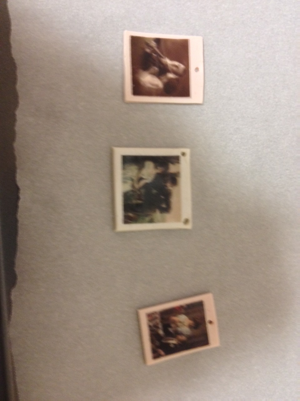
A prime example of this was my initial struggle with figuring out how to do clay transfers.  


Pictured first real success after about ten or so failures

It took me a lot of tries before I got a process down that worked.  It is especially frustrating with limited energy and chronic pain.  When you have a very finite amount of energy it's deeply frustrating to feel like it was wasted.  Learning the lesson that failures lead to understanding and success has been a really important lesson for me.  


Pictured several failures 

I asked the advice of a couple of people and got some answers that were helpful.  I usually have a rough time asking for help or accepting constructive criticism.  I finally set it aside for this project though.  I got some advice that helped me improve my process and finally get some consistent success! 

   
Success!  :D

I learned a lot from this particular project.  That while failure is indeed frustrating I can't let it stop me from trying again.  No one ever starts off perfect with anything.  We start with scribbles an work our way up.  Being kind to others comes easy for me but being kind to myself has always been harder.  My new phrase I repeat to myself whenever I find myself feeling down about my work or wanting to procrastinate is, "Strive for excellence not perfection."  I have also had to learn that if I push myself too hard and get too worn out my quality goes down the drain.  I've had to give myself permission to do things in smaller batches so I don't sacrifice the quality and that's okay.  

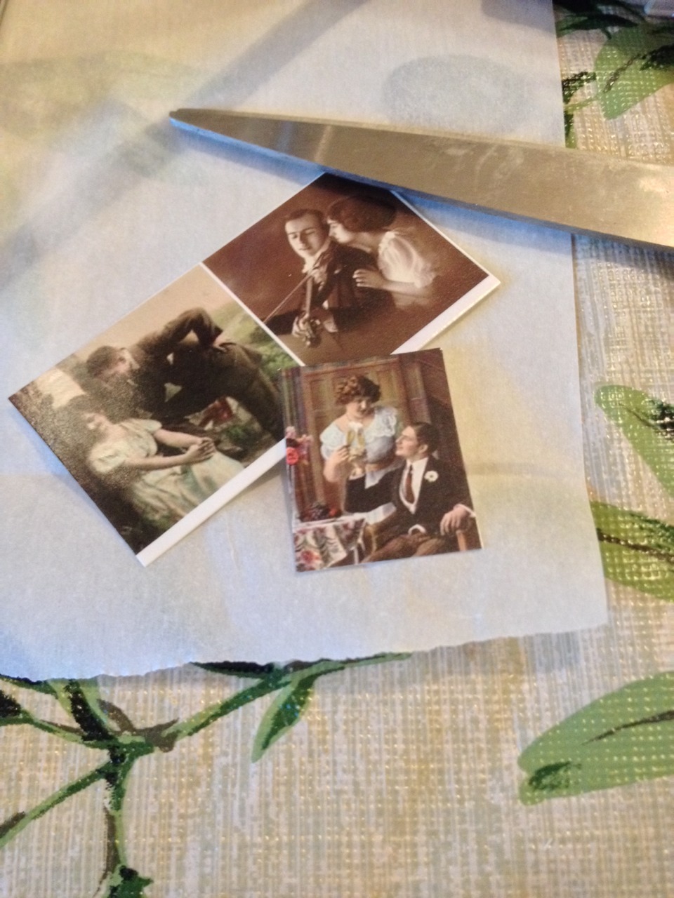
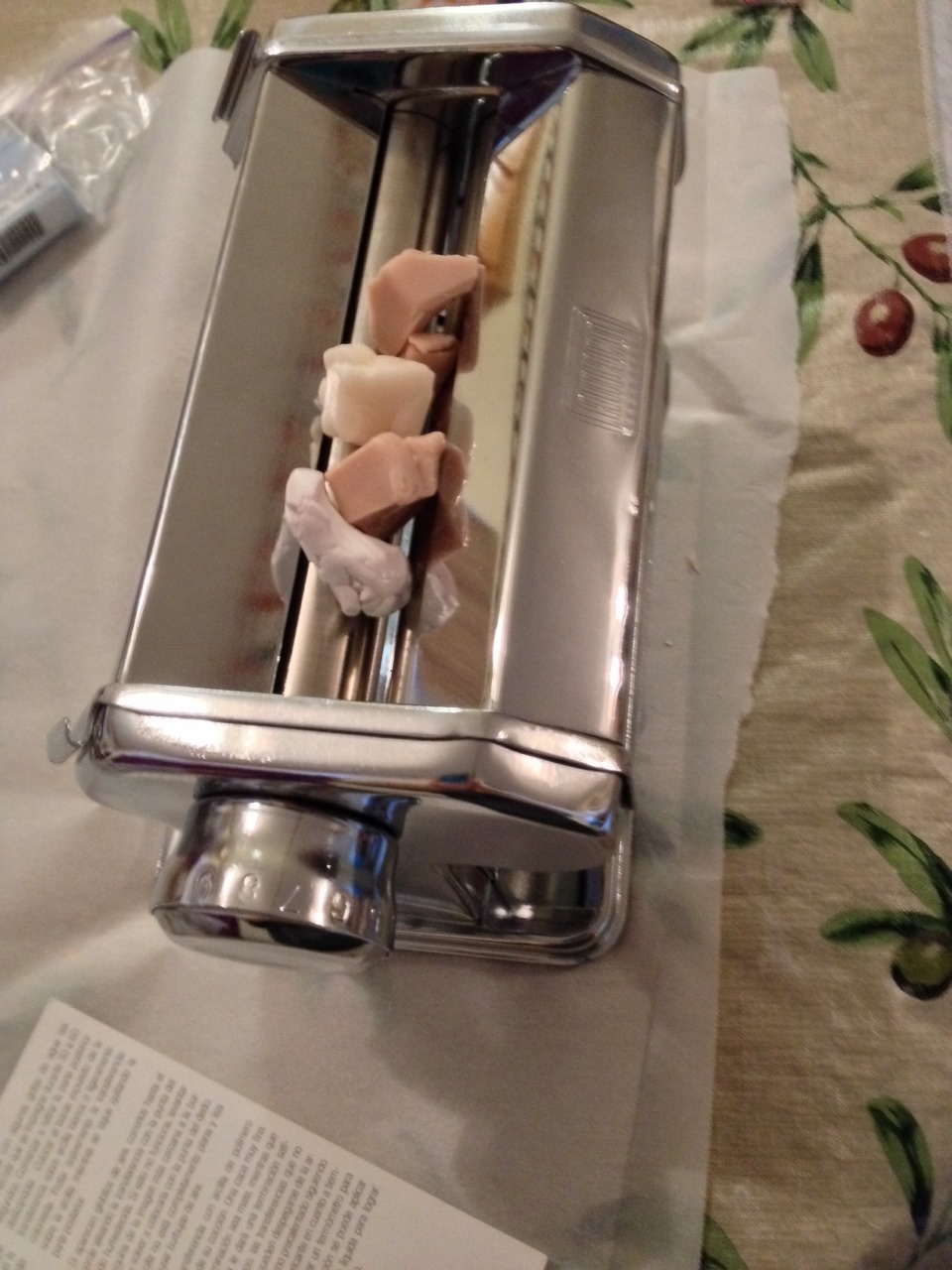
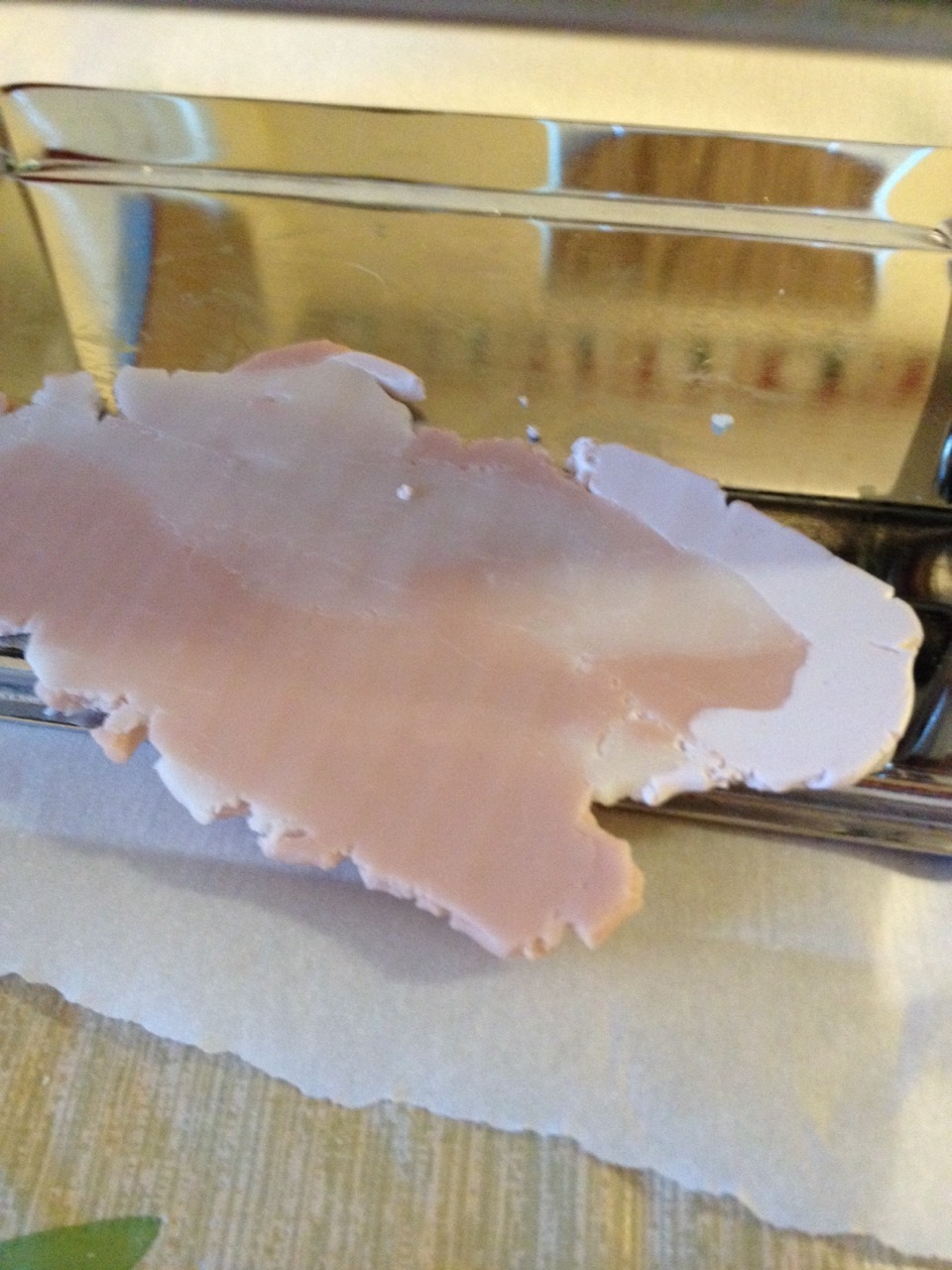
Process pics!  -  


                                                                       FINAL!  :D


I still struggle a lot.  There are still times I get very down on myself.  This is an important lesson so I'm going to keep going.  Hope you enjoyed this post!  <3  :D  


Sunday, September 1, 2013

Finding Inspiration

Inspiration is something we all seek in one way or another.  It's also very personal and a broad topic. Ask several people how they get inspired and I can guarantee there will be some very different answers.  So today I'm going to talk about what inspires me and break down my creative process a bit.

Inspiration and creativity have always been nebulous concepts to me.  Probably because I feel the same about art in general.  It's difficult to give art a concrete definition.  If you ask one person they'll tell you there is nothing artistic about post minimalist sculpture you ask another person and they will tell you it's the highest art form.  

For me, inspiration, much like art, comes in all sorts of packages.  I find inspiration in the vast majority of things.  I have a collection of pictures I've taken while out and about that range from fabrics and produce to broken glass and classic cars.  I take all these pictures because there's a lot of beautiful colors, patterns, and even great lighting references to be found all over the place.  I'm inspired by anything that I find to be aesthetically pleasing or anything that speaks to me on some level or another.  

Music is another thing that is a huge source of inspiration for me and emotion is a big driving force behind my art.  Especially anything that is very poetic sounding.  I also love instrumental music as well.  A lot of times I close my eyes and just let my imagination go.  I picture so many different things in my head when I listen to music.  

Surrounding myself with images from other artists I really admire is another way I stay inspired.  When I look at things that are really beautiful it makes me want to go and apply myself and hone my own artistic skills.  Being really open minded with what sort of art you like helps you to be more flexible in your own work.  Or at least that's how it's worked for me. haha.  Being open to many different aesthetics and not just one style, look, or feel can be very instrumental in helping an artist define their own style.  

Here's some examples of pieces that really inspire me- (all of these are links on deviantart and all are clean and safe for work!!!  Just fyi haha)
  
Honeysuckle Moon by Coyote Mange, Insecurities by Astridle, Mandarin Fish 2171 by Sooper DeviantL'aurore by BluminaThe Last Snow by PixieCold, Orion by ApofissUse The Experience Wisely by Starwalt DesignWater Dreams by Aeternum-ArtTears In Heaven by KuschelirmelTime Never Lost by Emerald DepthsOrange and Blue by Katie AlvesXVIII by KiwixSleeping Beauty by Charlie BowaterPainting Pictures by PhatPuppy ArtRio Cool by BurtnSyoku by KoyamoriSomeone Like You by Rona KellerSketchbook Page by Lady 2Tea Spirit July French Earl Grey by MobilePants.  

For me a huge part of art is trying to show others how you see the world.  Van Gogh, Dali, and Monet are classic artists I really admire for this reason.  They all had such different views of the world around them.  Viewing the world through a different lens is a big part of being an artist.  To see the beauty and complexity in things that others find to be mundane is really brilliant and lovely.  When I make art that's what I want to bring to the table.  I have a lot of cool pictures in my head that I want to share with others.  I love bringing the visions in my head into the real world.    

Well, that's a bit about how I feel about inspiration and art in general.  I feel like I barely scratched the surface but that's enough for now.  :)  


Monday, February 25, 2013

Announcements!

This post is about the announcements I made on facebook.  I'm going to address them in order in more detail.  


 1. I will be taking down all the earrings I presently have in my shop. If there's any you want I suggest buy it in the next couple of days.


These were made in a rush for a craft fair.  While I can assure you they are of the utmost quality structurally I don't feel that the design work is there like it ought to be.  Basically from a design standpoint I don't feel like it's my best work.  Unfortunately the craft fair did not pan out due to unforeseen circumstances which is okay, life happens.  They're just taking up space, not selling, and I don't feel it's my best work so I will be deconstructing them in the near future to make new earrings and necklaces with them.  I like making scrap necklaces, they're probably my favorite.  These will be perfect for this!  Scrap necklace- when I take left over beads and match them up, typically by color, and string together a bunch of different beads.  


2. I will be bringing some of my inventory back to etsy. 


I'll preface this by defining a reseller in the context of what I'm using the word for.  On etsy it is supposed to be only for handmade products (barring crafting supplies and vintage items).  A resller is someone who buys mass produced product and passes it off as handmade and blatantly claims it is handmade.  For me art theft falls under this as well in the context of speaking about etsy.    

This one took a lot of thought.  I left etsy due to the rampant reseller issue.  I have really strong principles and the idea that etsy did not care about the resellers really got to me in a bad way.  The site is just swamped with them.  One of the worst was a particularity infamous event involving them featuring someone who was selling supposedly handmade, designed by herself, furniture and it turned out she was a reseller.  This coupled with being scolded by the etsy team and told art theft was not an adequate reason to flag a shop and a very flippant attitude from the ceo about theft and reselling just really did me in.   

I felt like leaving would make some sort of statement.  I really believed that by doing that I would no longer be supporting their morally bankrupt ideals and cheating.  I finally came to realize I can't live my entire life trying to avoid every unpleasant person and corporation or I'd have to become a hermit.  Hermits do not run successful small businesses.  I was getting a lot more attention for my work on etsy than storenvy.  By leaps and bounds.  I guess storenvy is just too little known and to be perfectly honest, as much as I love that site, their category system is really lacking.  


TL;DR (too long didn't read)- 


I let my anger and my principles overrule my sense when it came to keeping my business on the right track.  They're there to make a buck and so am I.  If I avoid every business/person who is willing to cheat to line their pockets then I won't get anywhere with my business.  I'm going to have to bite my tongue and deal with people/businesses I'm not overly fond of if I want to get anywhere.  At the same time that doesn't mean I have to compromise my principles and beliefs in the process.  The best I can do is not be like them.  


Conclusion?  


I will be putting just a few things from storenvy up there from every category.  I will have links in the descriptions to storevny where people can find more like items for sale.  Nothing will change on storenvy I will just be moving a few of my products over there for more surface and so I can have my work in two places.  


3. The sale on my jewelry I have up on storenvy will be ending in the next couple of days.   


This one is pretty self explanatory.  I don't see any reason to keep it going when it's not gotten anything sold.  I've started making new products again and will just continue on with the way I've been doing things.  I will have more space for storage freed up when I deconstruct the earrings so it's not really an issue anymore.  


4. I will be expanding my inventory to include hair accessories. 


This is also pretty self explanatory.  I have a few pictures of what I presently have made on The Gilded Butterfly's page.  I need to retake the pictures because I don't feel like they're up to par with what I can do now.  Some of them are even a bit blurry.  That was back when my arms were weaker.  Having a bigger camera and doing fairly frequent photography have both helped take care of that. lol  I also have a tripod for taking product pictures and night photography.  So that ensures the pictures will be extra clear.  


On the accessories themselves-


Right now what I have in stock are headbands with flowers I clipped and glued to them.  They're actually from a scrapbooking kit and they're fabric flowers with feathers on them. I even made one for myself because I like them so much.  :)  I'm trying to incorporate some easier to make things into my repertoire because making jewelry is really hard on my back and I want to produce more products and get more things up in my store.  I found some nice headbands at hobby lobby that are thin and soft (they don't pinch or hurt at all!) and attached the flower clips I made to them.  :)  

I want to try making some more complicated things in the future but I think these will be a good first run.  :)  

Well, that's all for now.  Thanks for taking time to read this!  


Tuesday, November 27, 2012

Updates On Things

I'm tired and lack the creativity to come up with a better title.  I have a terrible habit of mentally spreading myself too thin because my mind is kinda like pinball and not like a laser beam.  So in doing that I've wound up getting myself so overwhelmed it's been difficult to get things done I need to get done.  I had a mini break down type thing.  Basically had a crappy day, cried a lot, and talked about it.  Now I feel like I'm ready to push through and get stuff done.  

Honestly, I hate internet logistical stuff almost as much as I hate math.  To put this in perspective for those who don't know me, I spent many of the nights I had math homework crying in frustration over it.  I actually really enjoy the design part.  I get a lot of gratification from it.  It's like making  a large piece of art that has moving parts that all work together.  

I have a bare bones understanding of html and css.  Basically enough to get me by with minor hiccups on the internet.  I also have a knack for figuring things out just by looking at them for long enough.  Unfortunately that is not nearly enough.  

I feel like web design started out how cars started out.  Relatively easy to repair on your own then as time went by people saw a way to make money and with technological advances it just became so convoluted only people who got some serious education or experience were able to figure the system out.  

I had it so close.  So very close.  Then when I uploaded my template (basic instructions for the website's layout, colors, functions, etc.) joomla said it was out of date.  I literally laughed and cried at the same time.  Still not entirely sure why I laughed.  I think it's because this entire thing is positively ludicrous.  

I've decided I want to give it a go with wordpress.  I need to do more research to be absolutely sure.  The website will still have the same address as before.  It will just look different.  I've decided if I like wordpress I'm going to make a template in artisteer on saturday (boyfriend has artisteer on his comp).  I just don't want to settle for a wordpress theme when I just don't care much for the ones offered.  

I've not worked on art in so long it's pitiful.  I'm not giving up on it.  It's far too important. It's just taken a back seat to figuring out the web stuff.  In other happy news I'm getting a new tablet for Christmas and I'm very excited because it will open up a lot of new possibilities for me artistically with my digital art.  :)  Fancy tablets don't do the work they just give you more room to grow than a basic one does.  They can pick up on strokes in a lifelike way which is awesome.  Digital art is a good fit for me because I can do it laying down or reclining so no stress on my back.  I still want to illustrate traditionally because I enjoy it.  I just like the look of digital art too.  So both are good.  :)  

I'll try to be better about staying on top of this in the future.  

One last thing about the jewelry.  I fully intend to have the new necklaces up by tomorrow evening.  So check storenvy soon.  :)

Friday, June 22, 2012

Still Learning

Hey everyone.  I wanted today's post to be about my photography and how I've learned. 


So far it's been an uphill battle when it comes to photography the jewelry for business.  Now the flower pictures I take to paint are far easier.  I couldn't figure out for a long time why one was so much easier than the other.  It was like a smack in the face sort of moment when I realized why.  Reflective surfaces vs. matte surfaces.  


Take this for example-


Both are shot in direct sunlight but one turned out beautifully and the other looks completely washed out.  What's the difference?  Flowers and plant life have matte surfaces and the earrings in the above photo do not.  The earrings bounce back the light that's shined on them which gives a very white and washed out look with direct sunlight.  

I've procrastinated on finishing redoing my jewelry photos for this reason.  It takes a lot out of me to do the photos.  There's a lot of bending, reaching, and standing involved and it's exhausting.  I've only got so much energy to work with before it's gone.  Add that to the fact that it frustrates me to tears between the pain and fatigue and you get me not getting it done.  :P

So now my game plan is to use artificial lighting so I can have more control over how much or how little light I use.  Some of the jewelry actually needs more lighting.  Specifically some rhodonite earrings I made.  Rhodonite is more on the matte side of the scale.  It's a lovely pinkish stone but it's not got a very reflective surface so it needs more light to really show up nicely.

I've already taken a few photos using this new lighting system and so far it's gone pretty well.  I'm still learning so some photos are still not turning out how I'd like.  One thing I have definitely learned is don't shoot jewelry on a reflective surfaces because it comes out looking terrible.  I'd post an example of that but I can't find the picture.  I think I may have deleted it.  lol  Basically it makes the jewelry stand out a lot less.  :P

Thanks for taking the time to read this.  :)  

Thursday, May 24, 2012

The Great T-Shirt War

I've not been as faithful with updates I would like to be.  A lot has been going on.  At this point I don't want to go into detail because I'm worn out and I'm trying to focus on other things right now.  


As for the title, well it is pretty much what it sounds like.  I've been locked in a battle of wits between my computer, redbubble, society6, and CS5 to produce a good tshirt design. 


While I realize that computers are not sentient and therefore cannot be in such a battle with me it certainly feels that way.  Anyone who has ever grappled with a computer program understands what I mean.  


I think a lot of artists like to make it look effortless.  I think society conditions us to believe we have to look like we've got it all together or people will think less of us.  While that may be true in some cases I've come to believe that sharing your struggles humanizes you and bonds you to others.  Keeping hardships and difficulties completely under wraps is way too difficult and stressful to be worth the payout of having your neighbors be jealous you have time to keep a perfectly manicured lawn, perfect hair, and basically live a life that looks as domestically blissful as Martha Stewart's.  


So as an artist and a fellow human being I humbly present to you the evolution of the tshirt designs I've been working on.  


(Putting a watermark on failed tshirt designs may seem ridiculous but I'll tell you this, First rule of the internet- if it's not nailed down someone somewhere will steal it)


Original concept-


This is the first in the Terra Series I made and I love it but it won't work for a tshirt design.  Changes need to be made.  

First draft.  Hard edges don't look good on tshirt designs.  It was the wrong size and I didn't like how it looked on a shirt.


This was finally the correct size but I still didn't like how it looked on the shirt.  It was too long.

This time the dimensions were to my liking but the design still looked too cluttered and boxy on a shirt.


I was finally starting to get on the right track with this one.  I still felt like it looked cluttered.

So close but not quite.  As much as I love the scratchy pencil lines of this design there was too much white.  Soceity6's tee designs make anything white in a picture transparent and while this doesn't look super white on the actual lines the scratchiness was an issue because it let more white through and wasn't solid enough so the design blended into the tee too much which is what I continually ran into throughout these other incarnations of this design.  

So close!  I decided to go with a more vector like image for this and drew outlines and then painted in first flat colors then shading on top of that.  I wanted to keep with the colors of the original design but I despised them in this format.  It looked too much like the lakers.. or mardi gras..  Which, I'm sorry, but I find the combination a bit tacky.  It's just not my taste.  

And here we are at the final design!  I changed the colors to ones that looked nicer together and I fell in love.  


 So now you may be wondering why I haven't made this into a tshirt yet.  Well that's a lovely and complicated story that simply put I can't figure out the color format for redbubble.  I decided to opt out of using society6 for tshirts because I really despise the colors they offer and their format for isolating the image isn't the best idea, in my opinion.  So I've decided to go with redbubble.  One problem, despite changing the color profile of the image to match what they specify the colors look very gray when I upload the image.  So now I've decided to walk away from this for a bit and come back to it because it's frustrating me to no end.  I know there has to be something I'm missing but I'll figure it out eventually.  For now I'm focusing on photography and digital mixed media for the prints I want to make.  If you want to see the other versions of this wannabe tshirt design you can check out my facebook page for my art.  I have an entire album just for them.  lol  So that explains the title of this blog.  Sometimes art is war.  

The splatter brushes used in the background of the last two designs are from texture mate  all the other textures, compass rose drawing, and images are my own.  


Glossary of terms

Color profile- In simple terms it's instructions for computers on how to display the colors of an image.  This is pretty important for printers too.  Complicated explanation here.

Vector- To put it simply it's the blocky colors you typically see on tshirts and other various designs because they can be scaled easily without making it look blurry an pixelated.  More complicated version here with an example picture.  


So that's that.  Thanks for reading.  :)